UX Design · Case Study
KnightBites
A dining app concept for UCF students to discover food options quickly and easily.
Students can find dining locations but can't discover food options efficiently.
UCF's campus offers dozens of dining venues, but students know where to eat, not what's available until they physically visit.
- Menu blindness when choosing dining halls
- No way to filter for dietary restrictions
- Time wasted walking between classes
- Decision fatigue across 20+ locations
- Prices hidden until arrival
A mobile experience that puts food discovery at the center of campus dining.
KnightBites prioritizes what students can eat over where, enabling informed decisions before they leave their seat.
- Universal menu search across all locations
- Smart filters for diet, price, and meal type
- Photos, descriptions, and live availability
- Walking times after choosing food
- Meal plan and cash pricing side by side
Target Audience
Primary
UCF undergraduate students
Secondary
Graduate students and faculty
The Approach
Research methods and key insights
Methods
- Observational research during peak dining hours
- Competitive analysis of UCF's official app and similar solutions
Key Insights
- Students prioritize food type over location
- Time constraints make menu browsing essential
- Dietary filters must work across all locations at once
- Walking distance is more relevant than driving directions
Quantitative Research
Student dining pain points
Students mainly struggle with menu uncertainty, while location confusion and walking time are smaller concerns. Clearer signage and better menu visibility could make their experience much smoother.
Design Solutions
Key screens and what they solve
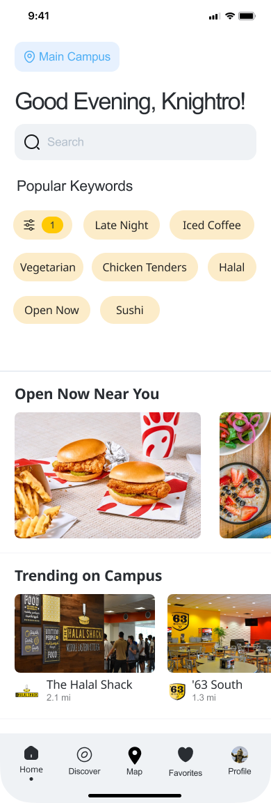
Home View
Shows open dining spots and trending locations, helping students decide fast without having to wander campus first.
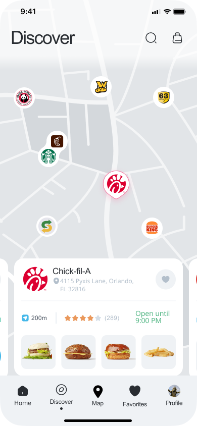
Interactive Map
Lets students explore nearby dining options, check hours at a glance, and get walking directions in one tap.
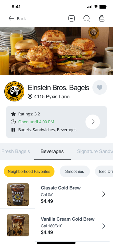
Restaurant Detail View
Highlights menu items, prices, and campus info including meal plan support and opening hours, all before leaving your seat.
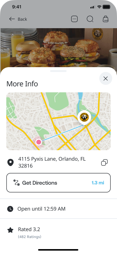
Map Overlay
Lets students get walking directions or check distance from their current location without switching apps.
Design Decisions
Choices and the reasoning behind them
- Used UCF inspired colors and rounded cards to keep the interface friendly and familiar
- Prioritized walking directions over driving for on-campus context
- Focused on large touch targets and short flows for students rushing between classes
- Placed filters up front so dietary needs are addressed early in the flow
Results
Students spend less time wandering and more time eating well.
Students spend less time wandering campus and more time enjoying meals that match their preferences and schedule.
Reflection
What I learned
KnightBites gave me a solid starting point for designing with a clear problem and solution in mind. As my first case study, it taught me how to connect research, design, and storytelling. I'd like to keep expanding the prototype, whether that's adding more dining filters, refining map interactions, or testing with real students.
Working on KnightBites taught me how to balance speed and clarity in a student focused app. Mapping out user flows before designing helped me avoid clutter and keep actions obvious and intentional.
Next Steps
With more time, I'd run usability tests with students to validate the flows and uncover friction points I may have missed. I'd also refine the search experience — right now it works, but there's room to make it smarter, like surfacing results based on a student's dietary history or time of day. Meal plan integration is another priority, so students can track their balances without leaving the app. Longer term, I'd explore live menu syncing directly with UCF dining systems so the data is always accurate, not just assumed.